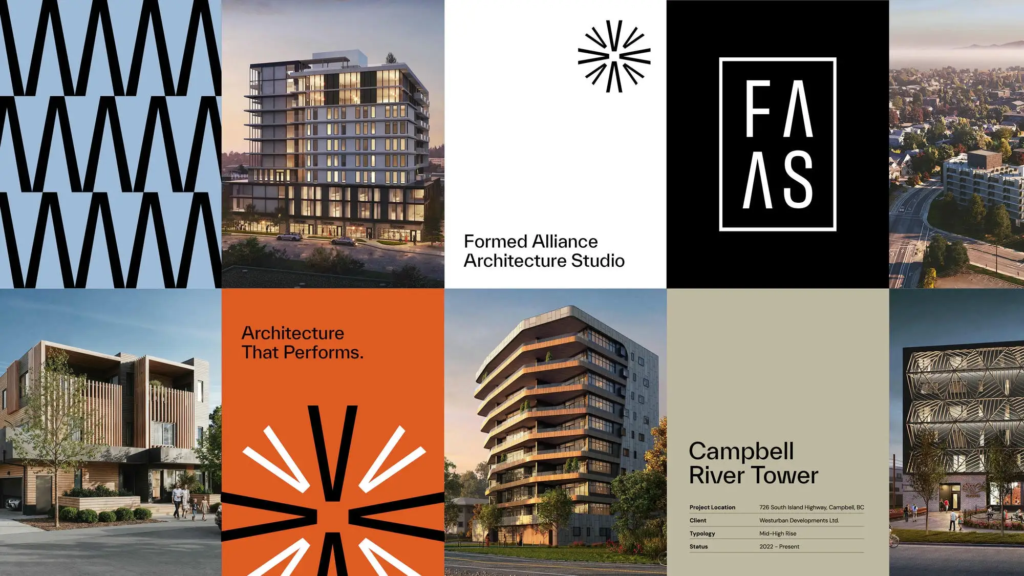
Graphic Explanation
The A-Axis links the “A” in FAAS with the architectural concept of an axis – a guiding line of precision and alignment. It reflects the firm’s progressive vision and role in moving projects forward with clarity and structural integrity.
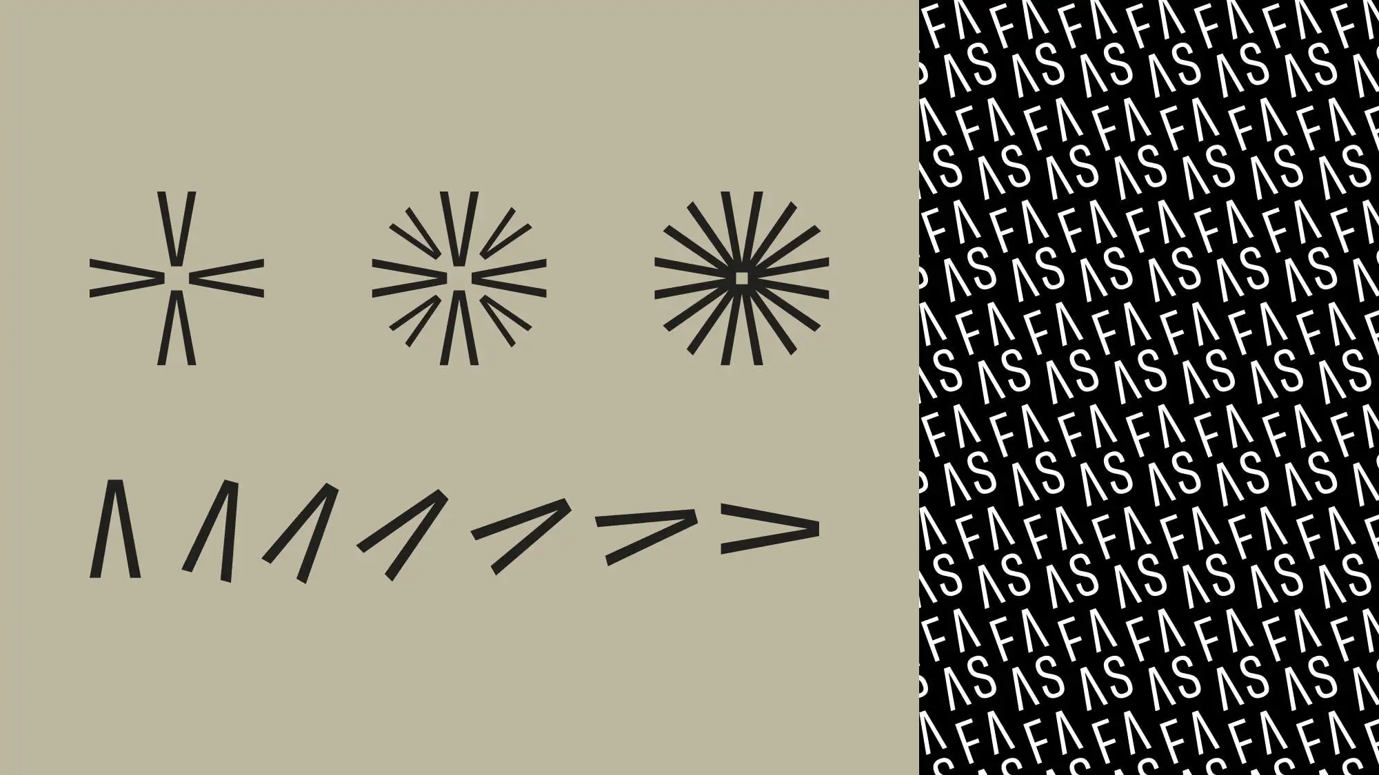
Usage
Graphics should be used selectively and without visual conflict. They should add visual impact to your layout to reinforce the tone of your communication. They can be used in the brand colours on specialty merchandise, environmental graphics, a high impact graphic spread or in digital applications as animation or static visuals.
Best Practices
—Avoid layering text directly over the busy areas of the patterns.
—Avoid pairing with imagery.
—Avoid using multiple patterns on the same page.
—Playing with the scale or crop of the pattern can impact the effect they have in your layout.
—Adjusting colour and stroke lines within the patterns is not recommended.
*Rules for usage to be finalized on completion of the upcoming collateral.